Grand River Blues Society
Proposing a website redesign to improve it’s Information Architecture
What is the Grand River Blues Society?
The Grand River Blues Society (GRBS) is a community based in Waterloo, ON. The content on their website consists of supporting local artists, youth education, community interaction, and preserving blues music through news posts, and hosting events. They aim to expand their community amongst the youth and elderly.
Seeing as their website is the heart of their community we are tasked with improving it's information architecture.
The Problem
How might we improve the GRBS website’s Information Architecture so that new and regular users can find what they're looking for easily?

The Current State of the Website:
Scroll through of GRBS website
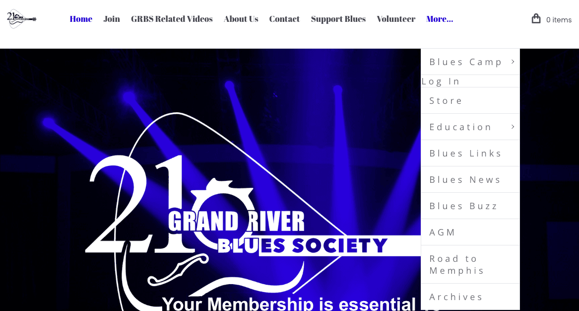
We found this website to have a “shallow and broad” structure, with it's long list of heading tabs at the top.
Who are the Users? What are they looking for?
While taking a look at the website we identified these possible users:
People looking to network and collaborate with other blues artists
People who want to attend events and are active listeners within the Blues scene
People who want to get involved (youth) in music camps and learn how to play Blues music
These users may want to know:
The current happenings within the club (upcoming events, contact information of musicians, achievements)
What the club is about; how do you join and subscribe to newsletters
Past information about the club (archives)
How do users organize information through an Open Card Sort?
Our team ran an Open Card Sort to get a first look at how people sort and organize the website’s content. We had 10 participants in total, and 2 of them were members of the GRBS (Grand River Blues Society).
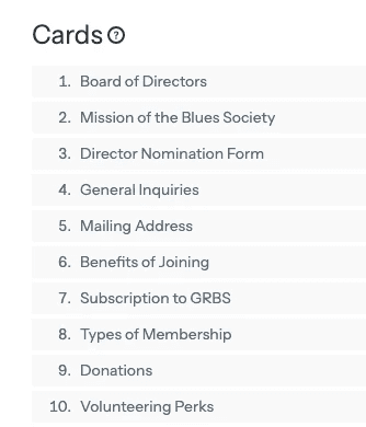
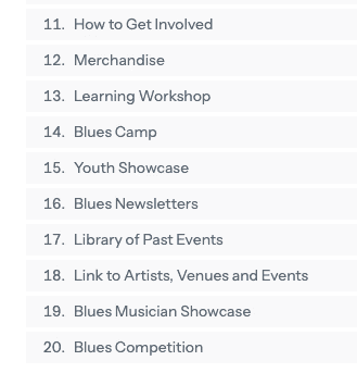
Cards that were used in the study
Results of Open Card Sort:
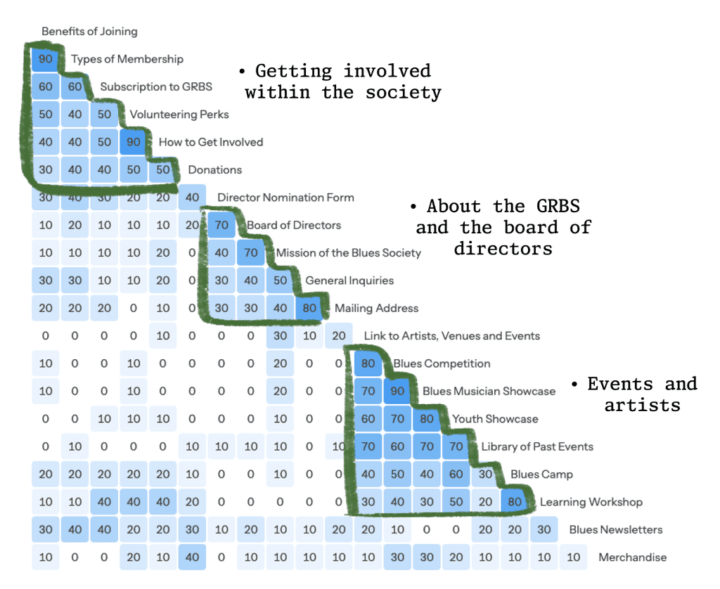
There were 3 main groupings were created with the cards:
Clusters found in similarity matrix
Our participants made groupings of six or fewer, meaning that we needed to change the current structure (“shallow and broad”) to a “narrow and deep” one.
Current GRBS website header
There will only be four top headers that have a drop-down waterfall for more pages within that subject category.
The headers would be:
About Us - Introduction to GRBS, directors, page for contact
Get Involved - GRBS membership, newsletters, volunteer page
Support Us - Donations, merchandise
Events and Artists - Competitions, educational workshops, camps
A/B Tree Testing with our new structure
Now that we knew what headers to use we ran an A/B Tree Test. There were a total of 7 participants.
Here were the two tasks our participants had to complete:
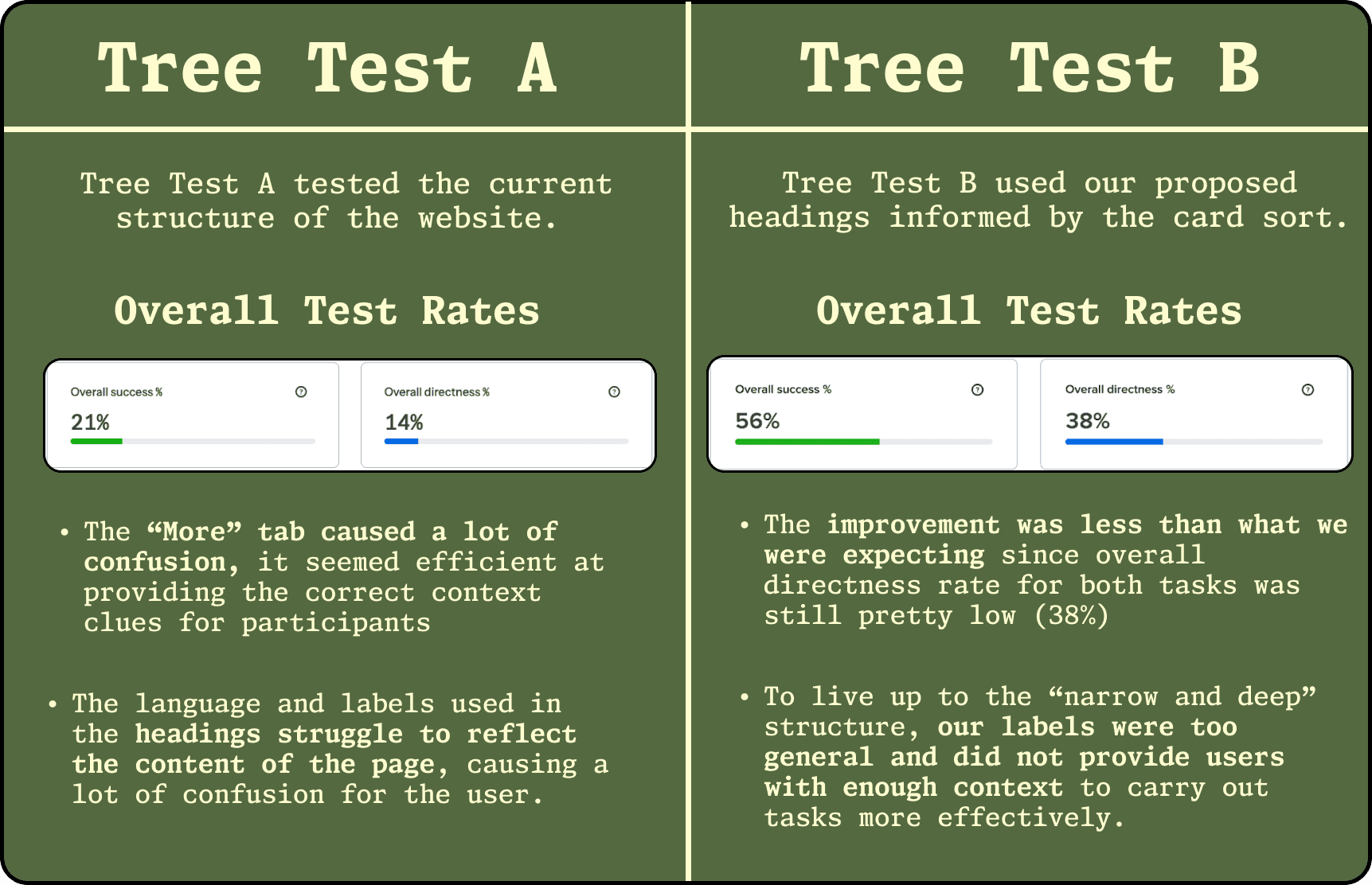
The (disappointing) results of both Tree Tests:
The results of these tests left us unsatisfied. We needed to find the problem with our labels.
Tree Test C: Pinpointing the problem
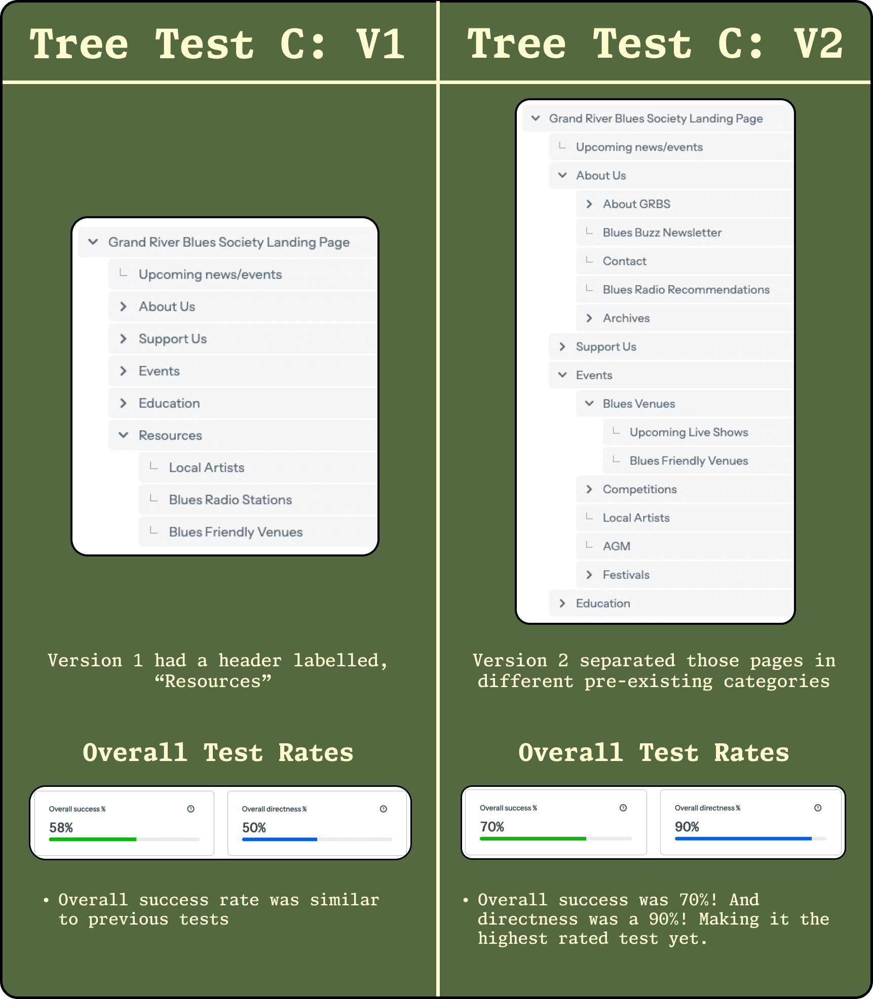
In order for us to carry on, we had to create a Tree Test C to a solution to our label problem. There were two versions of Tree Test C, mimicking the A/B format in our previous tests.
This means that in Version 2 of Tree Test C, we solved the problem we were having with the header labels!
The Solution: A Sitemap and Wireframes
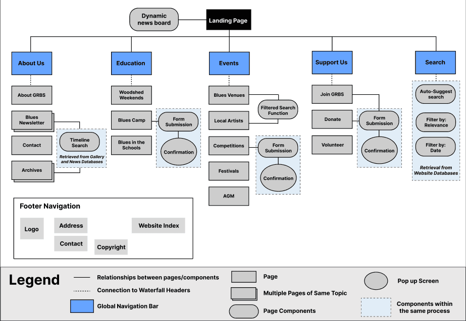
Next we created a sitemap to have an overview of our proposed structure for the website.
Site map of proposed structure
Our wireframes for our proposed structure consisted of:
Waterfalls
We utilized waterfalls so that users can find pages based on the categories found in the header.
Wireframe header showcasing the waterfall
Contextual Hyperlinks
Made hyperlinks that direct to different pages of the website:
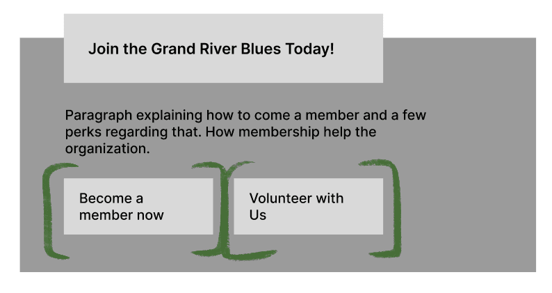
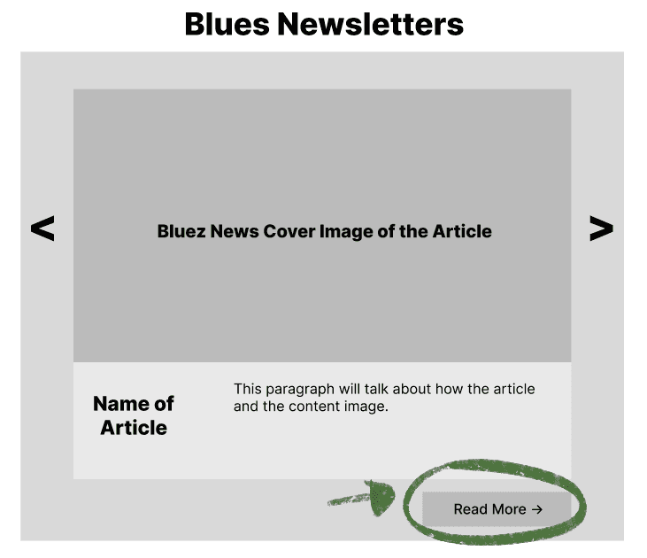
Wireframes of contextual hyperlink buttons
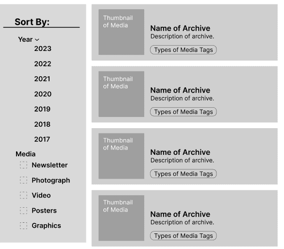
“Sort By” Filters
The newsletters were an important feature of the GRBS website, along with the archive showcasing past events, shows and news. We created a filter to make the search easier for these pages.
Wireframe of filtered navigation the "Archives" page
Form submissions
Joining memberships and applying to competitions were common on the website, so we created an improved form page.
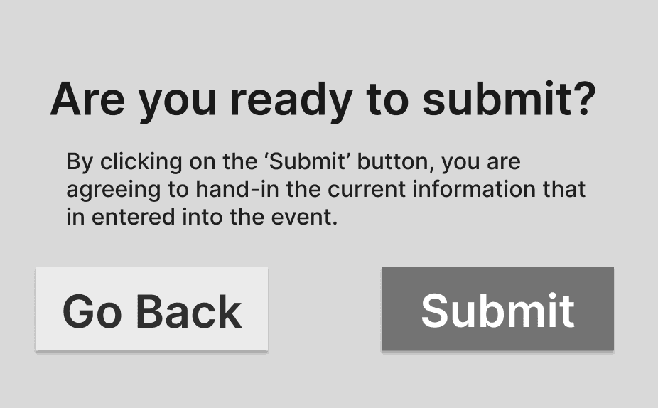
Wireframes of improved forms and form submission pop-ups
Search Systems
Adding a global search bar would make finding information on this website easier. We mocked up a search result page as well.
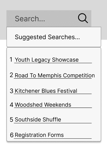
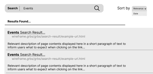
Wireframes of proposed global search bar
Reflecting on this project I…
Learned the importance of being a leader. It’s critical that everyone on your team is on the same page. Effective communication and understanding can help make the leadership role less daunting.
Realized how much I enjoyed UX research. I personally came into this field for design, but this project made me enjoy asking the how and whys.
Found out that things on a website are/should be intentional and always have a purpose. I didn’t realize how much work goes into information architecture and structuring websites with proper purpose, until this project!
Thank you to my team and professors that helped guide us on this project!

